
A cool hat shop along the countryside is surely fun, but to make a retail market, you need to switch online. To put it more precisely — The brick and mortar shop is an option while an online presence is a must.
And when it comes to making your e-commerce website/app a grand success, the mandatory tip is to “never assume”. The design that went a super-hit a year back, might not necessarily work this time; AND beyond that, your latest design experiment with another domain too, might not help much. So, TEST — Test every minute detail, every call-to-action and track the progress in iterations “as early as possible”.
The ideal stage to have these tests and iterate on designs is the “prototyping phase”. This article talks about driving your eCommerce venture to a great success by testing and tracking your project instantly and easily
Track the engagement
Tracking user engagement on the app to inform redesigns, UX changes and flow will boost the ROI and make your app a profitable channel in your brand’s overall marketing strategy.
Parameters to look out for when you decide on the user engagement on your app prototype are -
1. Session Length
2. Time in app
3. Acquisition
4. Retention
5. Lifetime value
6. Where the user stays longest and where they drop off.
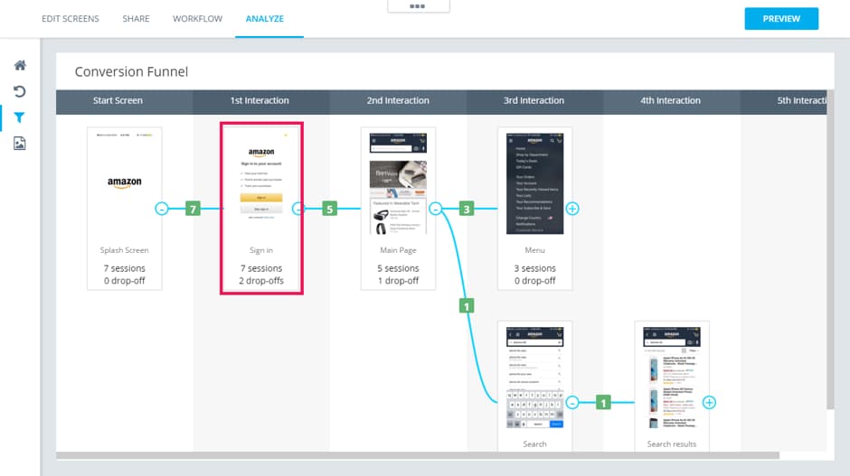
This was a UX experiment on the Amazon app prototype. The conversion funnel generated clearly portrays an abnormal percentage of drop-off on the “Sign up” mock-up. (These results are subjected to results obtained during the experiment). An insight as this guides the UX profession to iterate on the Sign up mock-up.
A/B testing with designs and text
Does a “BUY NOW” button convince more than “SHOP NOW”? A/B testing is comparing two versions of a design to see which one performs better. You compare by showing the two variants (let’s call them A and B) to similar visitors at the same time. The one that gives a better conversion rate wins! And this works miracles for an eCommerce venture.
How?
In the league to think differently, designers often experiment with new catchy words and designs. But are your thoughts aligned with the users? This is when A/B testing comes into the picture.
An example, with two different copy-writing for the call-to-action button -
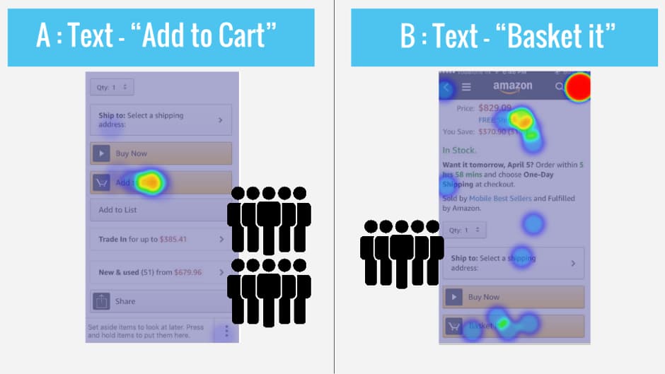
Takeaway from the test — This heat map results are pretty interesting. Having “Add to Cart” as the text gets concentrated attention on this particular CTA, but with an absurd text as “Basket it” (might sound cool though) get a very diluted attention. Users have tried other things on the screen as well.
Make checkout a smooth and quick process
We have all, some time or the other, been victims of an impractical or just plain unresponsive checkout system while trying to finish an online purchase. You have to make the checkout process quick and smooth because “they” want it so!
Action point — While iterating on your mock-up designs work on the 2 very crucial factors-
1. Average time spent to checkout
2. Average screens traveled to checkout
Keep a track of how the two parameters are varying with every design iteration.
Is the Call-to-action loud enough?
Your Call-to-Action is your sales representative trying to close a deal. So, the louder the better. Isn’t it? There are three advantages that a call-to-action ideally provides -
1. Direction to the users
2. A way to measure your site’s success
3. Keeps the focus on your site
e-Commerce websites need to keep the users excited and energetic on their website. Having said that, there are two types of Call-to-action required on the website. First, a call to action that clearly tell users what you want them to do — Call, Buy, Register, Subscribe, Donate.
Secondly, a CTA that creates a sense of urgency and a need to act now. These words should be so powerful that they encourage users to take an action immediately.
Create a “task-based” prototype to test
Things we conceptualize in our heads that seem awesome does not always shape out that way. Most of the times the reason being, friction in the UX flow. Therefore, it is always advisable to build prototypes based on multiple tasks. A complete prototype with all mock-ups might be good for presentation purpose but not for testing.
So, build multiple task-based prototypes and once each flow is tested and verified, combine it into a single prototype for presenting it.
Hope you found these prototyping and testing parameters helpful for your eCommerce venture.
This article was written by Monika Adarsh at CanvasFlip(http://ift.tt/1ZJ77Kh), an online platform for creating rapid prototypes and usability testing on them.


