I was born before my time. I realised fairly early on that there were some aspects of everyday life that I wasn’t going to waste my time on. I’d wait for a more efficient method.
Exhibit A.
(This is my actual handwriting — I just waited for my first PC, calligraphy may be darling, but my god it’s tedious…)

I loathed most things that felt laborious. I would spot the inefficiencies in everything. (Why iron a shirt when I could just wear a hoodie?) So it was no surprise that I ended up as a product manager. As opposed to the saying “If it ain’t broke don’t fix it” I always preferred the slightly less poetic “What the hell is this!? I’m not using this crap. I’ll build something better, gimme 5 minutes…”
So today I’m going to explain why there are only 3 places I enjoy shopping, and how you can be more like them:
- eBay
- Deliveroo
- Shoprocket powered stores (I feel no shame)
eBay
eBay seems to split opinions. I love it. I can buy things I’ll never use with 1 click. It remembers my payment details, my address and whisks me through the checkout process before I can ask “Do I really need this $250 deluxe self-flushing cat litter tray?” (I didn’t)
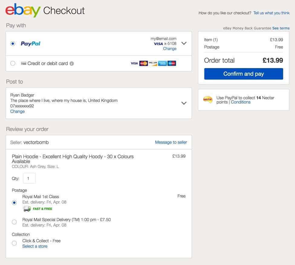
Some people hate it, they can’t seem to get through the flow. I think it’s down to PayPal, if you haven’t connected your account correctly, it can actually be a bit of a pain. This is where they let themselves down.
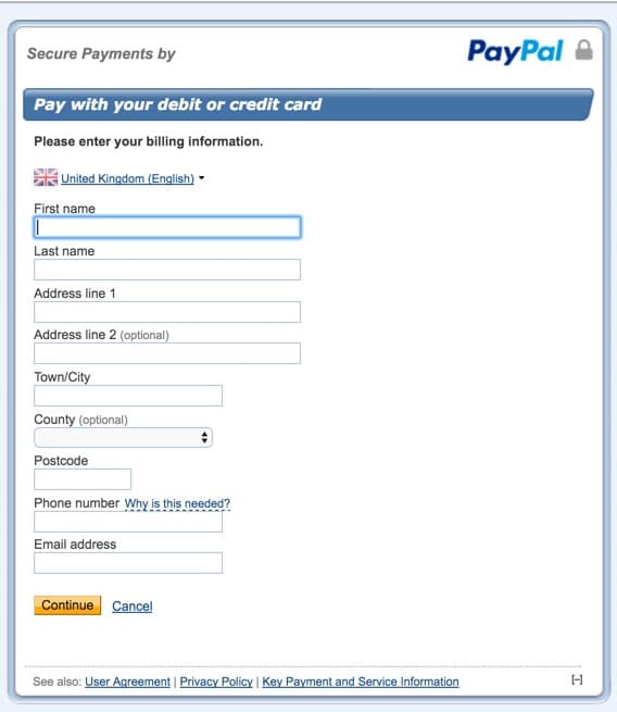
PayPal progressed online shopping faster than any other payment processor, but it hasn’t all been smooth sailing. By trying hard to make “pay with PayPal” a thing, they also made it quite hard to “pay without PayPal”. What if I’m on my mobile and can’t remember my PayPal password? Just let me pay with my card. Oh there’s a “checkout as a guest” feature with PayPal? Great let’s use that….wait it’s telling me my card was already registered with a PayPal account so now I have to login to PayPal. I’m done. Forget it.
OK so I may be incredibly impatient, but who isn’t? It’s the difference between a 70% and a 30% basket abandonment rate. If your customers can’t pay faster than their subconscious doubts about the purchase kick in, odds are you’ll lose the sale.
Here’s a real world example from a study by marketingexperiments.com.
Having 9 fields in your checkout form, instead of 5, could cut your conversion rate from 13.4% to 10%. Which may increase your cost per acquisition by 33%.

(source: http://ift.tt/M2nQTN)
As interesting as that is, why is your conversion rate only 13.4%?!
Are you guilty of any of the following unnecessary questions during checkout?
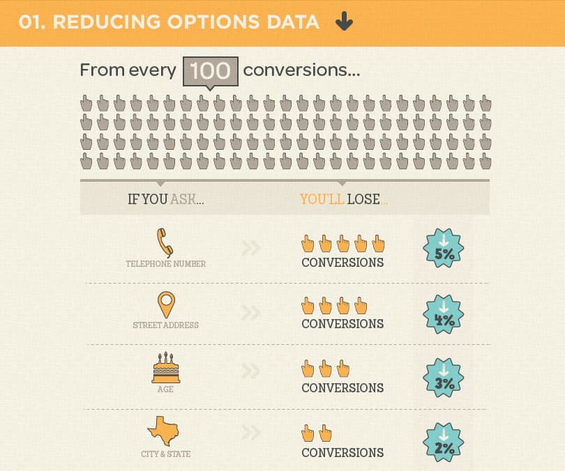
(Source: http://unbounce.com)
I’m sure there are a few businesses that really need a customer’s age, but could you get it at a later date? Maybe ask them after they’ve paid?
Put yourself in your customer’s’ shoes (no really, buy from your own store, regularly, when you’re out & about, when you’re drunk, when you’re stressed, see how easily you can shop from your own store when you’re not in the perfect shopping conditions. It amazes me how many store owners aren’t regularly using their own store and testing different scenarios.)
Be sure to always be searching for the outliers, what happens if your card is declined? Is it easy to use another payment method? Or do you end up stuck in a loop of error messages and page refreshes?
Deliveroo
I used to use Just Eat, regularly, it was my saviour at 3am and often my last resort after a late night. But every time I tried to order, it made me login with my username and password. Now, if I was able to type my email address & password using my tiny mobile keyboard at 3am, I wouldn’t be using Just Eat in the first place. I was lucky if I could manage to click the type of chicken burger I wanted, let alone type in my 27 character email address. Yet it took them years to add a “keep me logged in” feature to Just Eat.
Eventually, I switched to Deliveroo. They clearly knew their target market well and realised that when it comes to convenience apps, fat thumbs are king. Their checkout is smooth, clear and requires very little (if any) text input. Possibly most importantly of all, it works wonderfully on any device, simply point and click.
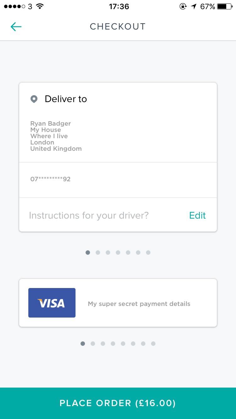
If you don’t absolutely need your customer’s name, don’t ask them for it. At Shoprocket, we have many stores selling digital downloads for example. They really don’t need to know anything about the customer during checkout except payment details and an email address. So that’s all we ask for.
Is your payment processor to blame?
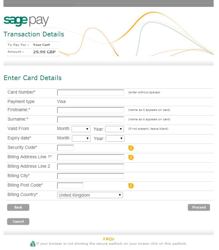
The biggest mistakes retailers make are often the most common. Having to pick “Mastercard” or “Visa” for example when entering card details. Why?! Nobody needs that information, and modern payment processors can work it out from the card number anyway. So stop it.
This brings me onto my biggest pet hate. Payment processors.
It’s not OK to bury your head in the sand about your payment processor and then complain when you only sell 1 pair of socks a month.
Just because Sage Pay told you the checkout form “has to look that way” doesn’t mean you have to stick with Sage Pay. We’re asked daily to add support for the many different gateways, but the truth is, we would rather you switched to Stripe than integrate a gateway that we know will kill your conversion rate.
We regularly review payment gateways, and to date, there are only 4 that we would feel comfortable recommending:
- Stripe
- Braintree
- Razorpay
- PayPal (The latest version)
Sure, your payment gateway offered by your bank might sound like a great deal, such as 0% transaction fees, unlimited payments, all for $25/month…
But there are two things you have to keep in mind.
1) That’s lies*
2) What use is a 0% transaction fee if you don’t actually make any sales?
*Payment gateways that focus on being “cheap” nearly always hide their fees in things like “merchant accounts”, extra fees for credit cards, or American Express etc. Read your small print and check your bills!
Modals — like in 1999?
You may have noticed that we use modals a lot, modals are often considered “popups”, but of course they aren’t really, and they’re making a comeback.
A modal is part of the page you are viewing. It’s not a new window and it’s usually not an advert. They’re also usually only triggered by an action, such as clicking this buy button.
We’re often asked by our customers “Can I embed the checkout form into my page? Modals feel tacky.” and our answer is always “Yes, certainly, behind all of the “out of the box” features you see from Shoprocket, there is a powerful API that you can work with directly, but our data shows that by doing so you will lose approximately 25% of your sales”. Of course, when they see the figures, they start to see modals in a different light.
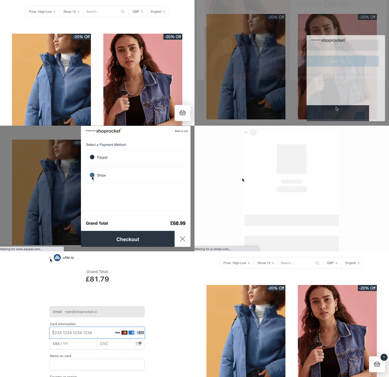
It’s all about capturing a buyers moment of intent. If they’re reading a blog post on your site about how great your latest product is, sell it to them, right there and then. If you can take them through a smooth, continuous flow without directing them to new pages or asking them to log in or sign up, your odds of closing the sale are greatly increased.
Modals also work well on any device. On mobile they can become a full-screen takeover, ensuring your customer’s focus is directly purely on the checkout flow.
Summary
Hopefully, the above has given you some inspiration on where your store could be improved. Remember:
- Don’t ask for information you don’t absolutely need
- Be sure your store works just as well on every device
- Ensure your payment gateway is super easy to use
- Use your own store! Regularly. When drunk.
We’re always analysing the data here, and continuously testing our entire checkout to see how we can add an extra 1% here and there to your conversion rates. Once we find a way, we roll it out automatically, so all stores using Shoprocket benefit from them immediately.
Ready to improve your conversion rates?
