What are Hosted Storefronts?
Shoprocket Hosted Storefronts are available on all our plans.
Hosted Storefronts are separate mini-sites, hosted on the Shoprocket network. These are quick and convenient to set up and do not require technical knowledge. Hosted Storefronts are ideal for sellers who do not yet have their own website or those that prefer to keep their Storefront separate from their main website (either by choice or technical limitations of their site).
The Shoprocket Network uses a global Content Delivery Network (CDN) to ensure lightning-fast speeds and absolute peace of mind when it comes to uptime. Our public status page is here
Shoprocket is an omnichannel eCommerce platform, that provides a seamless customer experience whether your users are shopping on your own website, a 3rd party blog, a Hosted Storefront, or your social media channels, all tied into the same management Sales Dashboard.
You can view a demo Hosted Storefront here: https://demo.shoprocket.io/
1. Go to Hosted Storefront page
From within your Dashboard, click on Sales Channels in the left-hand sidebar, then choose > Hosted Store.

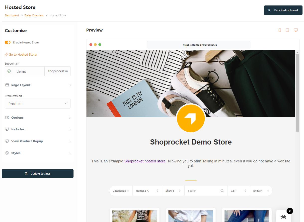
From there, you'll be greeted with the Hosted Storefront editor, along with a real-time preview panel to help visualise the changes you make.
2. Initial Customisation of Storefront
The Customise section on the left should already be open; here you will find:
- Enable Hosted Store - Enable/disable your hosted Storefront. Disabling will completely hide your Storefront.
- A link to visit your Storefront.
- Subdomain field - Set subdomain name: we suggest using your Storefront name, such as my-Storefront-name.shoprocket.io.

You can also use your own domain name, such as my-Storefront-name.com. Contact us through the live chat icon for instructions on how to set this up.
3. Changing the Page Layout
Expanding the Page Layout section below allows you to specify which elements you want to include on the page, such as:
- Show Store name - Show/hide the large Storefront name
- Store Logo - Show/hide and change the large Store logo.
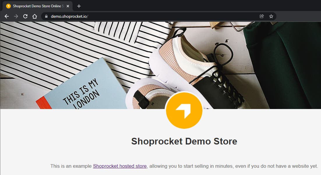
- Favicon - Change the favicon: the small icon that appears in the browser URL bar/tabs, more information here.
- Show Cover image - Show/hide and change the large image header across the top of the page. (1200px wide x 300px high is recommended size, in .jpg format).
- Show Description - Show/hide and change the Storefront introduction/about text below the cover image.
- Show Bottom Text - Show/hide and change the text area displayed at the bottom of your Storefront, ideal for terms & shipping policies.
4. Configure Product Display Options
Ensure Products is selected in the Products/Cart drop-down:

The following options are available by expanding the Options section below:
- Products to display - Choose to show all Products or only Products from specific categories.
- Product Size - Set the display size on the page (small, medium or large).
- Image Fit - Define whether the Product images should be cropped to the available size, or scaled-down (cropped will keep all images the same size and more uniform in appearance).
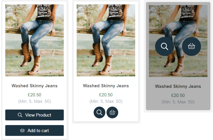
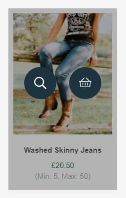
- Button Style - Choose between "Standard" (rectangular buttons with text) "Minimal" (circle buttons with icons) or "On Hover" (circle buttons with icons that only appear when hovering over the Product)
- Default Sorting Order - Define the sort order that Products will be listed by default (Default, Newest First, Name: A-Z, Name: Z-A, Price: Low-High, Price: High-Low).
- Products per page - Specify how many Products to load into each page (pagination will automatically appear or disappear).
- Hide Out Of Stock Products - Choose whether or not to completely hide Products that are out of stock, or show them with an "Out of stock" message.
5. Choose Page Functionality To Include
Ensuring Products is selected in the Products/Cart drop-down as above, expand the Includes section.
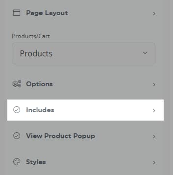
The following functionality can be switched on or off:
Product Card filter options
- Search Box - Displays the "search" field above your Products embed (only available on multiple Products embed)
- Sort Box - Displays the sort order dropdown menu (only available on multiple Products embed)
- Limiter Per Page Box - Displays the items per page dropdown menu (only available on multiple Products embed)
- Currency Box - Displays the currency dropdown for customers to view prices in their preferred currency (currencies must be enabled first in your Storefront settings)
- Language Box - Displays the language dropdown for customers to switch languages (Locales must be set up first in your settings here)
- Category box - Displays the Categories dropdown, allowing customers to filter Products by category (only available on multiple Products embed)

Product Card features
- Product Name - Displays the Product name (configured in the General tab of Product).
- Product Price - Displays the Product price (configured in the General tab of Product).
- Product Image - Displays the Product hero image (configured in the Media tab of Product),
- Product Summary - Displays the Product summary text (configured in the General tab of Product)
- Open Modal on Image click - Clicking the image opens the Product details in a popup modal
- View Product Button - Displays the button to open the full Product details in a popup modal
- Add to Cart Button - Displays the button to add the item to the cart (options will appear above on hover, Products that require more advanced options/variations will open the view Product modal on click)
- Min/Max Order Quantity - Displays the minimum & maximum order quantities available, if set in your Product (configured in the Inventory tab of Product).
- Free Shipping Ribbon - Displays the "Free Shipping" ribbon on your Product if free shipping is applicable (configured in the Shipping tab of Product).

- New Product Ribbon - Displays the "New" ribbon on Products added within the last 20 days

- Digital download ribbon - Displays the "Digital Download" ribbon on Products that include a downloadable file on purchase (configured in the Files tab of Product).

6. Configure Product Popup Modal
Ensuring Products is selected in the Products/Cart drop-down as above, expand the View Product Popup section.
This section only applies to Products that have at least one of Open Modal on Image click or View Product Button enabled in section 5 above.
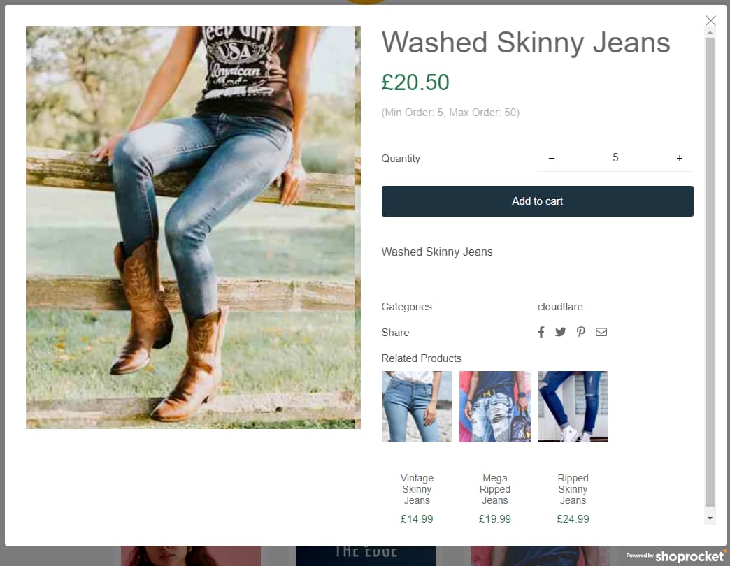
The popup can be configured by switching the following features on or off:
- Product Name - Displays the Product name (configured in the General tab of Product).
- Product Price - Displays the Product price (configured in the General tab of Product).
- Product Image - Displays the Product hero image (configured in the Media tab of Product)
- Product Summary - Displays the Product summary text ((configured in the General tab of Product)
- Product description - Displays the Product description (configured in the General tab of Product)
- Quantity select - Displays the quantity select field (if disabled, only 1 can be added to the cart at a time)
- Image Thumbnails - Displays the image gallery thumbnails
- Product Reviews - Displays the Product reviews
- Product SKU - Displays the Product stock-keeping unit (SKU) (configured in the Inventory tab of Product).
- Product Categories - Displays the Products linked categories (configured in the Categories tab of Product).
- Social Sharing Icons - Displays buttons allowing for 1 click share of the Product to social media channels
- Related Products - Displays the related Products (configured in the Related tab of Product).
- Min/max order quantity - Displays the minimum & maximum order quantities available, if set in your Product (configured in the Inventory tab of Product).
Further options
- Image Fit - Define whether the Product images should be cropped to the available size, or scaled-down (cropped will keep all images the same size and more uniform).
- Thumbnail Layout - Position the image gallery thumbnails horizontally below the image gallery, or vertically to the left.
- Variation Style - Choose between standard "dropdown" menus to choose from or "plain" text menus.
7. Configure Product Display Styles
Ensuring Products is selected in the Products/Cart drop-down as above, expand the Styles section.
Use the "Eyedropper" to set the colour of the following:
- Product Title
- Product Price
- Product Summary
- "Buy" Background
- "Buy" Text
- "View" Background
- "View" Text
- Product Background
- "View cart" Background
- "View cart" Text
Additional Popup Options
- Product Padding - Add padding within the edges of the Product card.
- Product Shadow - Add a shadow effect outside of Product cards.
- Rounded Edges - Add rounded edges to the Product card.
Custom CSS can be added to provide more control over the style of your Hosted Storefront, as described here.
8. Configure Cart Display Options
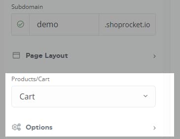
Ensuring Cart is selected in the Products/Cart drop-down as below, expand the Options section.
The following options are available::
- Basket Position - Choose the position to display.
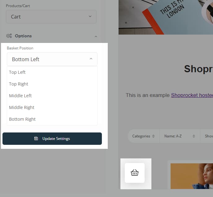
- Basket Style - either a bubble on top of the page or in a sidebar.
9. Configure Cart Display Styles
Ensuring Cart is selected in the Products/Cart drop-down as above, expand the Styles section.
Use the "Eyedropper" to set the colour of the following:
- "Basket" Color
- "Basket" Background
- "Basket" Counter Background
- "Basket" Text Color
- "Basket" Counter Text Color
- Cart Background
- Cart Text Color
- Cart Button Background
- Cart Button Color
- Cart Links Text Color
- Cart Border Color
Once you're happy with the Storefront appearance, press the Update Settings button to save, share your Storefront link, and start selling.


